I created and executed the research and testing strategy for the Skills Discovery toolkit. With limited resources and access to end users, I designed a lean research approach. From generative research to multiple phases of usability testing, I embedded user insight into every step of the design process.

Overview
Skills Discovery is part of a new product offering launched by Cappfinity, focused on helping individuals and organisations unlock and apply their strengths across the full talent lifecycle. Building on Cappfinity’s reputation as a world leader in Talent Aquisition & Talent Management, Skills Discovery expands into the Talent Development space — creating the foundation for a suite of new products.
Why the research mattered
In a company where research hadn’t traditionally been embedded in the design process, this project became an opportunity to demonstrate its value as a foundation for meaningful product decisions.
Learning and development experiences come with their own design challenges: engagement can be low, terminology is often abstract, and reflection tasks demand careful consideration of tone, pacing, and interaction.
To design something that users would actually want to engage with, we needed to understand how they interpreted, felt about, and responded to the tasks we were asking them to do. Research in this phase helped shape both the structure and tone of the toolkit.
Phase 1: Foundations for the toolkit
1) Research objectives
Understand user needs, behaviours, and challenges when interacting with the current Skills Discovery experience
Identify pain points and missed opportunities in the legacy product to inform the future toolkit design

Leverage existing feedback to ground new ideas in real user insight and avoid repeating past issues
Research questions
- What do clients value most and least about the current development offerings?
- What unmet needs or frustrations emerge from their current experience?
- How does the current product align (or fail to align) with how clients want to use skills insights?
- What improvements do clients or users explicitly or implicitly ask for in the feedback?
- Where do legacy design and content choices create confusion or friction?
2) Methods
Client-facing team interviews
Capture common friction points, user feedback and delivery challenges through proxy users.
Audit of legacy
product
Identify structural and content weaknesses in the previous toolkit.
Review of existing user feedback
Identify patterns in user sentiment, feature requests, and drop-off points.
3) Client-facing interviews
Why this method?
I chose client-facing interviews over surveys because we needed depth, not just sentiment. At this early stage, understanding why clients were engaging or disengaging and the context behind their behaviours was going to be most valuable. Quantifying sentiment will more important when creating and measuring against benchmarks for testing and iterating on the toolkit.
Who I spoke to
Since I wasn't able to speak directly with clients in this phase, I focused on gathering insight from 5 internal team members across customer success, sales, and configuration. While the insights were second-hand, these roles offered complementary perspectives: client-facing teams shared patterns in client feedback and behaviour, while the configuration stakeholder surfaced challenges with content delivery.
What I did
I ran semi-structured interviews, allowing for consistency across sessions while leaving space to explore unexpected themes. The questions were designed to align closely with our research goals:
- What kinds of comments or questions do clients raise at that point?”
- Do they skip over certain materials or seem unsure how to use them?
- Are there areas where content limitations or complexity contribute to that disengagement?

Approach and analysis
I ran semi-structured interviews, allowing for consistency across sessions while leaving space to explore unexpected themes
I captured and reviewed notes across all sessions, using thematic analysis to group insights into patterns. I also tagged quotes and insights based on their relevance to core assumptions, which helped inform early design principles and content strategy.
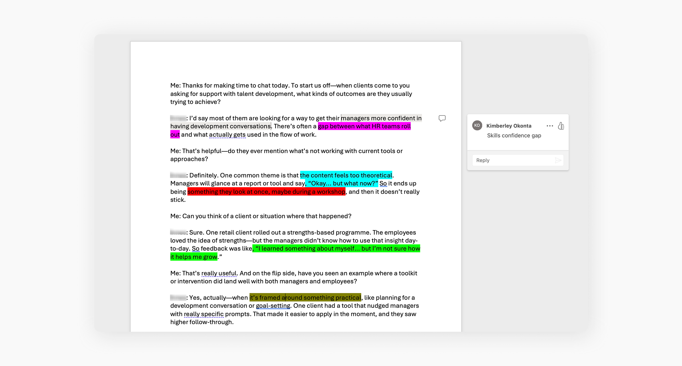
Excerpt from the thematic analysis conducted after the stakeholder interviews
What I learned
The insights gathered helped us pinpoint where existing solutions were falling short and clarified the design principles needed to deliver lasting value and real-world application.
Users are creating workarounds to share or save insights
"Some users take screenshots of their entries because there’s no way to export them or share with others"
Users don’t know what to do after an assessment
"Without a prompt to apply the insight, it kind of just sits there"
Some users feel overwhelmed without guidance
"It’s a lot to take in, especially if they’re working through it on their own"

Internal delivery is slowed by manual configuration
"There’s no system for flagging outdated content...we rely on someone spotting it"
4) Audit of legacy product
Why this method?
To inform early thinking around the Skills Discovery Toolkit, I audited a legacy onboarding product that sat within the same talent development space. While it served a different purpose, it offered useful insight into how users engage with self-directed learning and reflection-based tasks. This helped surface patterns, pain points, and design decisions that could influence how we approach the toolkit.
What I did
- Information architecture and content hierarchy
- Entry points and framing of the overall journey
- Instructional clarity, tone, and perceived user guidance
- Page-level structure and cognitive load
- Visual consistency and interaction patterns
- Opportunities for content modularity and reuse
I documented pain points and strengths using annotated screenshots and thematic tags. I also mapped the audit findings against early goals for the Skills Discovery Toolkit, such as clarity, reusability, and self-guided usability.

Auditing the existing product
What I learned
Users need more guidance in self-directed formats
Assumed too much prior knowledge, which could lead to drop-off or confusion
Content was often repetitive, without clear added value
Several reflection tasks and tips felt similar, leading to a sense of redundancy and potential disengagement
Missed opportunities for reuse and modularity
The product used one-off content blocks and page designs instead of reusable components, increasing content maintenance overhead
Inconsistent design language undermined experience
Variations in UI elements (e.g. heading levels, buttons, spacing) made the experience feel less polished and less trustworthy
The audit also helped me map which existing components or patterns could be reused, which would need adjustment, and where we’d likely need to start from scratch. This early component audit informed our modular design approach and helped reduce future design and build effort.
5) User insights from legacy product
Why this method?
While interviews and the product audit had already given us useful insights, I also reviewed existing feedback data from the product. Though limited in scale, this dataset offered a first hand perspective on how users were experiencing a learning product. This served as a useful parallel to what we were beginning to explore for the Skills Discovery Toolkit.
This helped me spot signals around engagement, perceived value, and user expectations that supported or the themes that emerged from the previous two methods.
What I did
I gathered:
- Likert scale sentiment ratings
- A small number of free-text user comments
- Internal notes summarising user reactions
I reviewed the entries and lightly coded them based on:
- Sentiment (positive, negative, neutral)
- Focus area (e.g. clarity, engagement, usefulness)
- Experience stage (e.g. intro, task, summary)
While not comprehensive, this validated previous findings about where users were getting value and where they were losing interest or momentum from their perspective.
Quantitative insights
Signals of content repetition
"I felt this training repeated a lot of the content already covered multiple times in other materials"
Need for stronger guidance
Only 45% of users rated the task instructions as ‘clear’ or ‘very clear’
Partial completion
"...I didn’t know if this was for me"
Phase 2: Usability testing (high-fidelity prototype)
Before committing to development, we ran usability testing on a high-fidelity prototype to validate our foundational design logic, core content structure, and interaction flows. The goal was to identify any major usability or comprehension issues early, ensuring that the toolkit would be intuitive and valuable to users before build effort was invested. This helped reduce the risk of rework and supported a leaner handoff to development.
What I did
I conducted remote, moderated usability testing with 5 participants drawn again from internal proxy users. Participants were asked to complete core flows in the prototype, including:
- Navigating into the toolkit from the assessment platform
- Working through a tool and reflection task
- Completing a task and interpreting the output
- Interacting with supporting content
The sessions were designed to capture first-time comprehension, ease of use, and user reactions to content tone and structure. I used a task-based script and encouraged them to think out loud.
Approach to analysis
I captured notes across usability testing dimensions, including:
- Navigation & flow comprehension
- Clarity of instructions and tool framing
- Content tone, relevance, and perceived value
- Points of hesitation or misinterpretation
- Suggestions
I then coded and grouped observations by issue severity (e.g. must-fix before build, nice-to-have later) and theme (e.g. content clarity, visual hierarchy, interaction feedback).

Tracking feedback from participants
What I learned
Users struggled to form a clear mental model of the toolkit


Refine homepage copy to emphasise value of key features and tutorial; consistent page structure and modular layout

Navigation was generally intuitive, but lacked reinforcement cues
Include breadcrumbs, progress indicators for each section; persistent exit points; active state cues; reposition page heading and details
Missions were perceived as one of the most valuable areas of the toolkit
Make Missions more prominent so users can access them quickly and understand their value upfront; more guidance to help users get the most out of them
Uncertainty around positioning limited perceived value for non-managers
Update approach to content for certain areas of the toolkit to broaden relevance
These insights helped us move into development with confidence in the usability of the design.
Phase 3: Live Beta Testing
Research objective
Why this method
After implementing design and content changes based on usability testing, we launched a live beta to validate those improvements:
- Assess whether previous pain points had been resolved, particularly around navigation and comprehension
- Evaluate the stability and behaviour of interactive components across browsers and devices
This phase allowed us to identify both remaining UX gaps and technical friction that wasn’t visible in prototype testing.
What I did
We released a controlled beta version of the toolkit to a limited group of internal users. I monitored usage patterns and gathered feedback via:
- Direct observation sessions
- Screenshots and recordings from testers encountering bugs
- Ad hoc verbal and written feedback during structured walkthroughs

Tracking feedback from participants from the live beta testing
I also conducted follow-up interviews with some testers to better understand their task flow and reactions to changes.
What I learned
Broken buttons, browser compatibility issues, unreliable interactions
Conducted a full interaction QA audit across major browsers; Rebuilt or simplified high-friction components
Task instructions and video-based activities still felt unclear
Introduced short usage prompts; repositioned task guidance and supporting tips so they appear at the point of need
Reflections
Building on insights from earlier phases, we used this feedback to prioritise final changes and refine the overall experience. These iterative improvements informed the first version of the toolkit released to a select group of pilot users as part of the MVP launch.
Post-Launch Research Plan
Based on design principles and their related success metrics, I outlined a post-launch research plan to help establish baseline metrics from which we could focus on improving the product experience over time.
Design for Repeatable Reflection
Research Focus
Keep Interactions Lightweight
Research Focus
Content-Led Relevance
Research Focus
Structure for Sustainability
Research Focus
This includes tracking usage analytics:
- Total users vs. returning users
- Frequency of use
- Drop-off points per section/tool
- Pathway heatmaps
- Which sections are most revisited
Final Reflections
This research journey was shaped by real-world constraints, shifting priorities, and a need to stay resourceful. Even with these things, I managed to deliver valuable, data-driven insights that helped shape the toolkit in a way that ensure it was not only function, but also valuable and intuitive.
What went well?
- Layering multiple insight sources, including stakeholder interviews, usability testing, and existing user data
- Combining qualitative feedback with lightweight, task-based testing to validate assumptions quickly
- Using proxy users effectively when access to target users was limited
- Evolving hypotheses as the product matured, allowing each phase to build on the last
- Adapting methods to fit tight time and resource constraints, which encouraged clarity and faster iteration
What I've learned
- The importance of designing research that evolves with a product’s stage of maturity
- Staying close to user expectations—even through indirect or proxy feedback—can still generate valuable insight
- Great user experiences aren’t built all at once, but shaped through continuous discovery, testing, and iteration
- Flexibility in methods is key when working within real-world constraints without sacrificing research impact


