I led the design and creation of the Cappfinity Design System to unify the visual language across a complex digital ecosystem. This system was built to balance brand consistency with product-specific usability across websites, SaaS and enterprise tools, as well as e-commerce experiences.

Overview
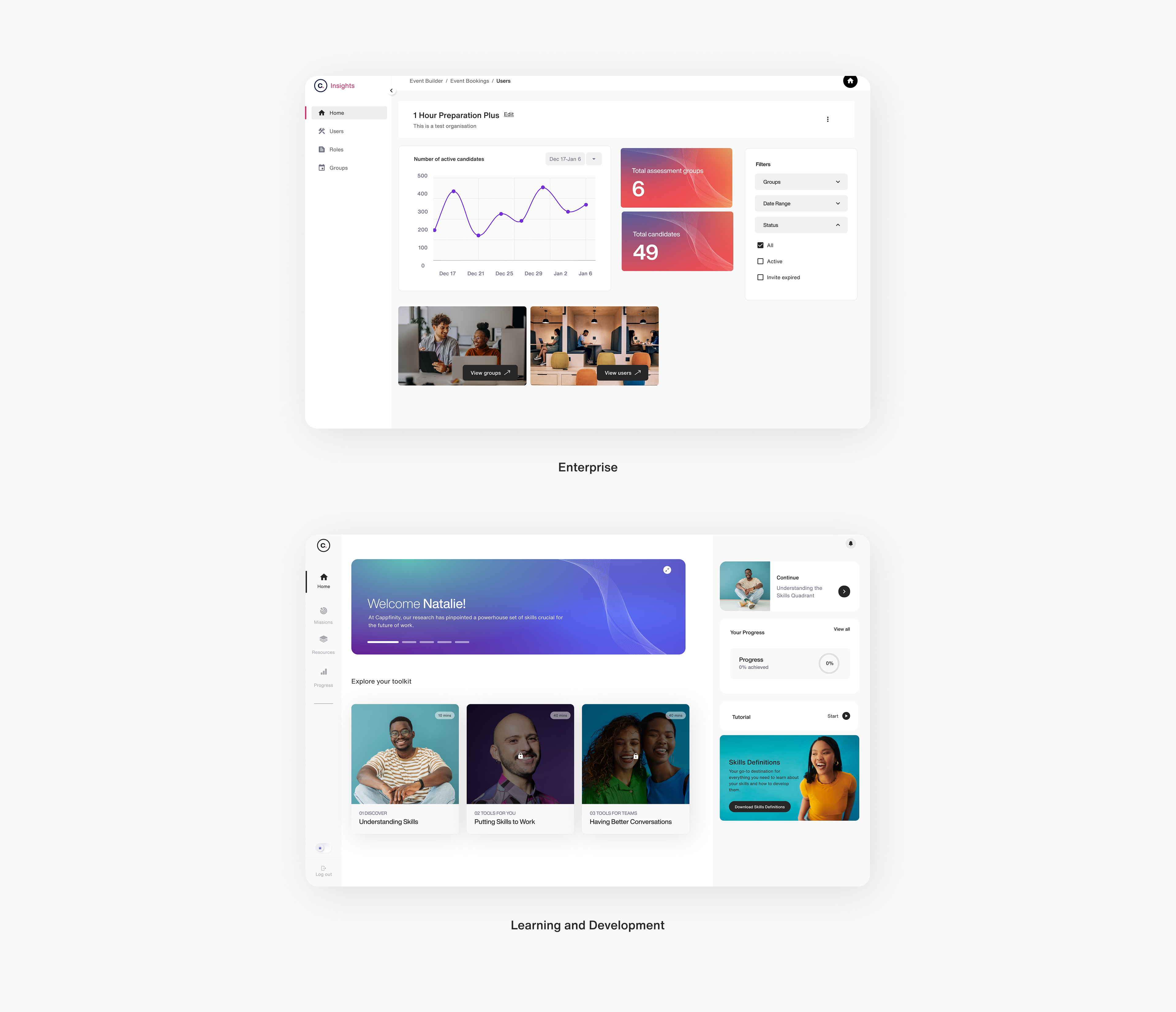
Cappfinity are global leaders in measuring and developing potential in Talent Acquisition and Talent Management. Cappfinity product ecosystem spans enterprise tools, assessments, learning tools, and marketing websites, each built in different teams with inconsistent design standards. As the lead designer, I led the creation of a new design system to bring cohesion, improve usability, and reduce inefficiencies.
This was a step toward creating a unified and scalable digital experience to support future productisation. It now supports multiple products enabling teams to move faster and design more consistently, while building in flexibility for product/brand specific patterns.
Product/UX Designer
UX Audit, System Strategy & Architecture, Component Design, Design Ops, Facilitation
Team
2 Engineers, Brand Manager
Date
February 2023 - March 2024
A cohesive design system supporting 10+ digital products

40+ reusable, accessible components created
Adopted across 4 digital products, with active contribution from design and engineering
Why a design system, and why now?
When output outpaces structure
When I joined Cappfinity, the business was starting to productise more of their offerings. Years of saying yes to client requests had resulted in platforms full of bolted-on features that were functional but had poor usability, was hard to scale, and difficult to onboard new users.
The consequences:


Inconsistent user table designs within enterprise products highlights the need for a unified component system.
Understanding the impact of lacking systemisation helped us define what success needed to look like for this design system.
What the design system needed to do:
Lay the foundations for productisation
Improve usability across platforms
Embed design thinking in dev workflows

Align products with the refreshed brand identity
Discovery and audit
At Cappfinity there is a lot going on, so before zooming in to the specific inconsistencies, it was important to understand exactly what the product ecosystem was comprised of.

The Cappfinity Product Ecosystem with some example products
Product Audit
I had 4 main goals for the audit:
Understand how different platforms handled similar features/content
Identify UI component inconsistencies both across and within product types
Identify accessibility issues across platforms but particularly in assessment tools
Start to identify where things could align and where we would need flexibility

I used Trello to organise the audit. It became a tool our devs and PMs could use to reference specific issues, screenshots, and component discussions.


Trello board used for UX Audit process
What did the audit reveal?
These findings became the foundation for the design system work:
18+ variants of core components within enterprise tools


Standardise core component structure and define baseline specs
No standard approach to colour with contrast issues on more than 30% of screens.
Define brand colour tokens and usage rules with built-in accessibility standards

Around 25% of UI components not reusable due to being hard-coded for specific contexts
Create modular, context-agnostic components and document expected behaviours
Visual and behavioural drift without a shared standard for when to differ
A decision matrix to assess whether variation was necessary or not for documentation

Lack of visual through line and consistent layouts across Websites, Enterprise products and Learning and Development products uncovered by the audit
Stakeholder discovery
Given the range of products and the differences in usage goals and contexts, a legitimate question I needed to ask after looking at all these inconsistencies was "Is the divergence we are seeing here justified?"
These questions would require input from various people - designers, product owners and engineers. I facilitated a couple of workshops to help us, in a structured way, identify where the system needed to be adaptable.

Plan for facilitating a workshop to help identify where and why flexibility would be needed in the design system
In these discovery sessions we mapped components across products using a Same / Similar / Different framework and paired this with a contextual audit of each product’s purpose, users, and constraints.

Contextual mapping: Understanding the context and constraints of each product

Intra-product type SSD: identify what can be reused, adapted, or needs redesign within the same product
The within-product type Same/Similar/Different activity identified what variation existed and the contextual audit identified why some legitimate variation might exist. When combined it allow us to see where divergence was necessary at the within product level.
This created a stable baseline for cross-product component mapping.

Cross-product component mapping: defining where alignment and divergence can be justified at the cross product type level
Consistent at the core, contextual at the edges

A visual demonstrating each level of the design system orbiting the core tokens
This structure solves the challenge of systematising a fragmented ecosystem by anchoring consistency at the token level, while progressively allowing flexibility outward, so product teams can meet local needs without compromising global integrity.
Laying the foundations
Designing with the build environment in mind
Collaborating with developers early helped me align the design system’s foundations with Angular's architectural needs, shaping how tokens, theming, and documentation were structured.
Simplified Token Structure
Sign-Offs to Avoid Rework
Configuration Over Composition
Defining primitives
Taking guidance from the Brand Manager, we defined a shared set of raw values to anchor the system, ensuring consistency.

System-wide constants, aligned with brand, and used as the foundation for semantic token mapping
Defining semantic tokens
To make these primitive values meaningful across different contexts, we needed a layer of abstraction. That’s where semantic tokens came in.

Examples of semantic tokens, the element they are supposed to refer to on an interface as well as the linked default primitives
Whilst there are default values applied, it's best to think of these design tokens as value neutral. It's about defining what something is not necessarily how it looks yet.
Avoiding bloat in the token system
Based on previous experience, I recognised that tokenising everything can lead to unnecessary complexity. I worked with engineers, product owners, and other designers to identify where it made sense to make something a token. That's where yet another decision framework came in:
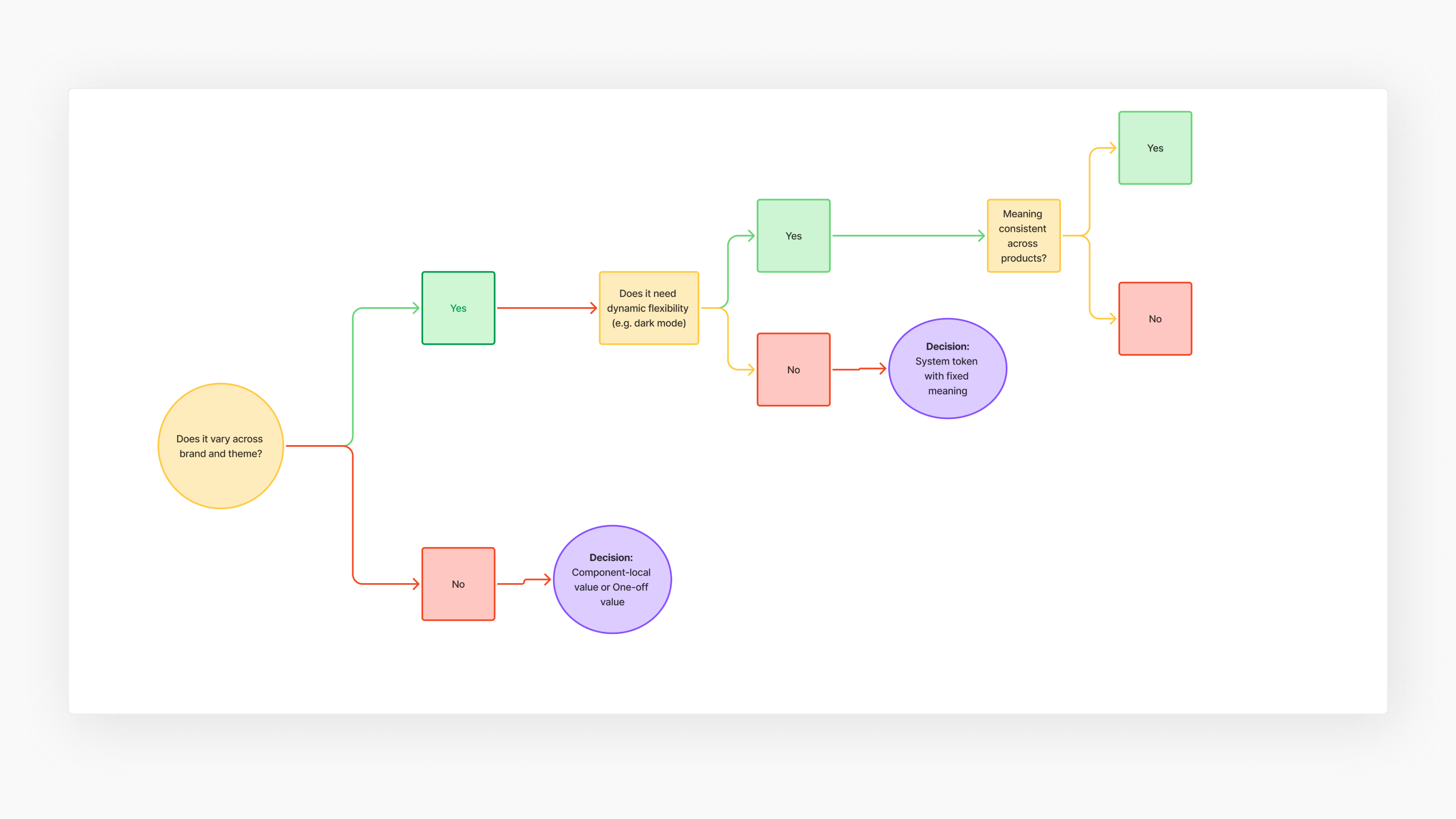
Decision-making framework for deciding whether or not something should be a token as part of the design system governance
The tokens could end up in one of five categories: static value, static semantic, themed semantic, component-level and alias.
Feeding into base components
Tokens alone don’t create usable interfaces. The next step was translating these values into functional UI through base components. This allowed me to separate component structure, interaction and accessibility rules from visual expression.

This diagram shows how base components consume tokens, creating structure for components
Theme-level expression without fragmentation
To demonstrate how the design system supports visual flexibility, I'll zoom into how I applied theming to the Card component. This example shows the pay off for everything we had done to this point.
1) Understanding variation across contexts
What I did
Audited how the Card component appeared across products and found widespread use but with significant visual and behavioural differences.
Why it mattered
Contextual mapping helped determine that many of these differences were justified, shaped by differing UX goals, content density, and product-specific interaction patterns. Some within-product differences were avoidable, but most between-product variations were purposeful.
2) Building a base component
What I did
Abstracted the shared logic of what makes something a "Card" into a single base component.

A base Card component built from system styling tokens and configurable content areas, enabling consistent structure with flexible expression across products.
Why it mattered
Despite visual differences, every card was fundamentally doing the same thing on the interface: it previewed content and directed users to act. I codified common behaviours and planned for Angular's configurability to toggle optional elements via inputs.
3) Theming the card across the ecosystem
What I did
Applied theming to allow brand and product-specific expression based on different user goals and content densities.

Card component adjusting to different product contexts whilst remaining behaviourally consistent with a clear visual through line
Why it mattered
Even as layout and styling shifted, each instance remained recognisably a "Card", in form and function, thanks to consistent logic, shared anatomy, and alignment to the base component. This illustrated the power of the system to balance cohesion and contextual expression at scale.
This illustrated the power of the system to balance cohesion and contextual expression at scale.
Even the best laid plans...
... weren't quite the best. Despite all the upfront thinking, structure, and system logic I’d put in place, the first phase of rollout surfaced cracks I hadn’t accounted for. Before unpacking those in detail, here's an overview of my approach to the first rollout:
The plan
Objectives
- Test design system viability in a live environment
- Identify gaps in documentation, structure, and developer adoption
Rollout Scope
- One enterprise product
- One learning product
- One B2B website
My Approach
- Documented token structure and component states in Storybook
- Created Figma component specs with interaction notes
- Relied on existing dev workflows

Documenting components in Storybook to try and ensure alignment between Figma and code with a live, version controlled source of truth
So what went wrong?
Mistake #01: Documenting the what, not the why
The documentation showed how components looked and behaved, but lacked functional context. This made the system hard to use in practice, especially in enterprise products with complex content.
In a low UX maturity environment, design was often left out. Features were pushed top-down with tight deadlines, and the system wasn’t yet robust enough to handle that unpredictability.

Inappropriate use of the modal component: too much complexity and too many consequential actions for a transient surface
How did I address this?
- Included design intent, not just spec
- Flagged UX risks with misuse
- Demonstrated components in real product contexts to show practical usage
Mistake #02: Out of sight, out of mind
Due to other project demands, documentation eventually became a stand-in for my ongoing involvement. Without regular checkpoints or feedback loops, I lost visibility of how the system was being implemented.
How did I address this?
- Introduced Continuous Improvement Loop process
- Build accountability with lightweight governance e.g. checklist, clear acceptance criteria
- Reinforced shared ownership of design

Our continuous improvement loop connects Figma, Storybook, and developer workflows
Mistake #03: Trying to grow with default behaviours
Another key issue was relying too heavily on existing development workflows. While this made initial integration feel faster, it ultimately came at the cost of design fidelity. This way of working encouraged doing things the easy way.
Storybook’s integration with Angular was clunky, so developers often defaulted to existing code rather than using it. The result: components that technically "worked," but no longer aligned with the system’s visual or behavioural logic.

The modal component, while an improvement from where we started in terms of brand alignment, but still a clear departure from intended designs defined in Figma
You can't systematise your way out of culture
This experience became the catalyst for taking the initiative to define an actual design ops strategy and process. It became clear that no amount of component refinement or documentation could compensate for a lack of systemic support for design. For the design system to succeed long term, attitudes towards designs role had to improve. Without that shift, the system would always risk being sidelined, no matter how well it was built.
Design system showcase
After the first rollout exposed the gaps in our processes and design influence, we hit pause, partly due to engineering resource constraints, but also as a chance to regroup. I used the breathing room to implement all the improvements to the documentation and processes based on lessons learnt from the first release.
By the time we were ready to relaunch the system months later, we were armed with a better, more resilient process.
Foundations & Primitives
These foundational tokens ensure consistency across the system while allowing for theming for different brands and product types.

From design to code
What started as raw values was translated into semantic roles in code that formed the base for real, live components on interfaces. Storybook bridged the gap between Figma and frontend, surfacing the tokens powering each UI element.

The journey from primitive tokens to the CSS variables to live, themed "Label" component

Storybook preview of the primary Button component switching between Enterprise and Marketing themes
Between product type variation
The system supports visual and functional divergence at the between product level while preserving a shared foundation. This was enabled through themed tokens and product-level variants.
Buttons
Adapt to hierarchy, layout, and action, without breaking system rules.

Primary navigation
Marketing supports quick orientation for conversion; Learning minimises distraction with a compact layout; and Enterprise defaults to an expanded view to support multi-tasking and admin-heavy workflows

Cards
Flexes for content density and range of content types with a clear shared visual identity and predictable interaction behaviours

Within product type variation
Within-product type variation was sometimes necessary. For example, adapting hero layouts on the B2C e-commerce site to better support conversion. These were handled through prop-based flexibility and scoped semantic tokens.


Design system in action
Semantic tokens and structured overrides allowed for brand and product-specific variants, supporting different platform nuances, and UX goals, all while maintaining a a visual through line.


Digital Media Toolkit
As part of a wider initiative, I partnered with the Brand Manager to integrate our design system components and documentation into our Digital Media Toolkit. This gave non-design teams a clearer of view of what our product ecosystem could look like with the system fully rolled out, helping to build momentum.


The Digital Media Toolkit — a shared space where teams access brand, design, and marketing guidance
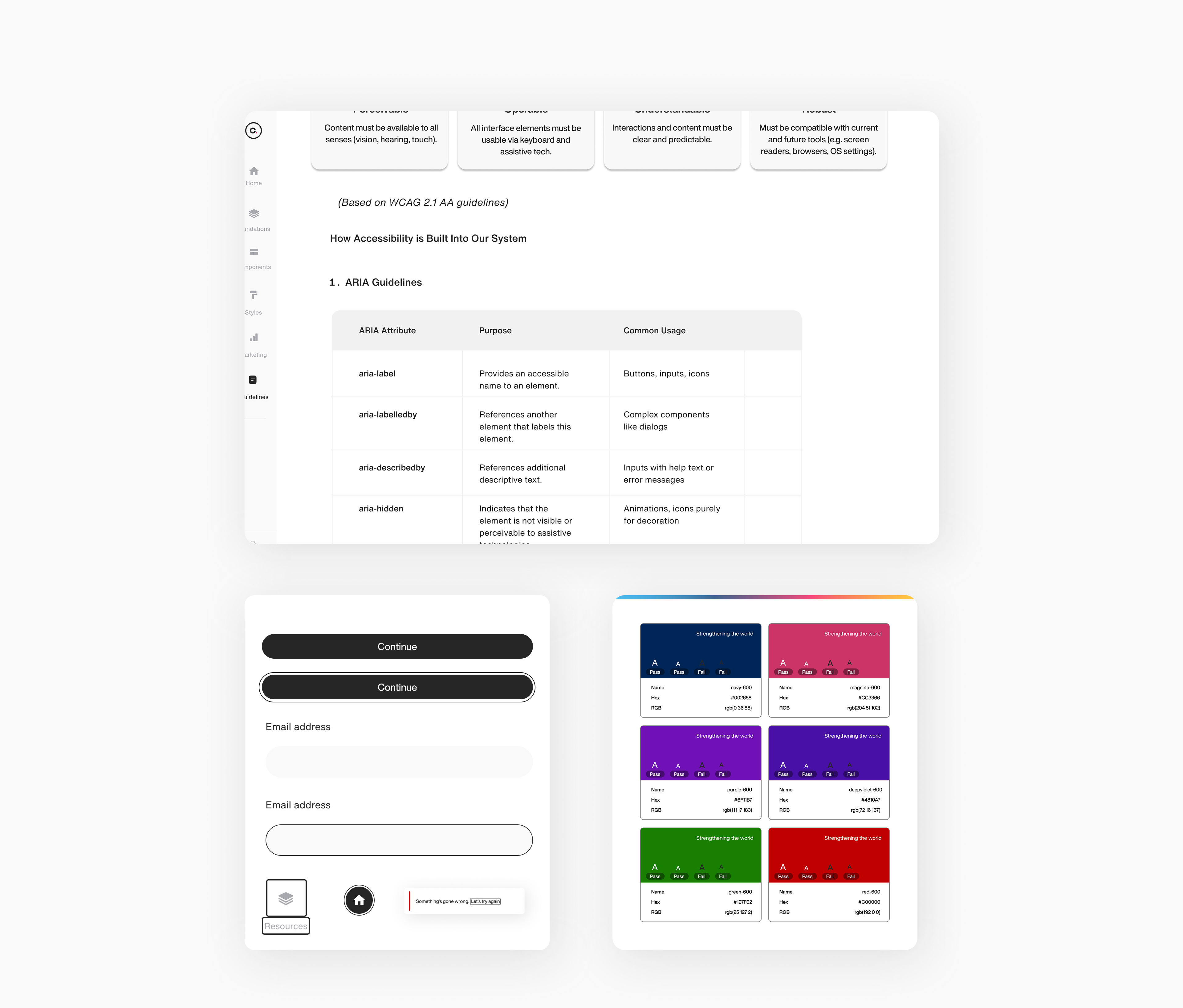
Accessible by design
Accessibility and responsiveness were built into the system. This included colour token contrast rules, keyboard-friendly components and semantic markups, ensuring accessible, and responsive UI patterns that adapt.
Impact
A cohesive design system supporting 10+ digital products
40+ reusable, accessible components created
Adopted across 4 digital products, with active contribution from design and engineering
Looking Ahead
Design systems are never truly "done". They evolve with the products and teams they support. While this system has already greatly improved visual consistency across the Cappfinity ecosystem and improved how design and development relate to each other, full adoption across all products is still a work in progress.
Creating this design system highlighted the importance of speaking the language of your stakeholders. Embedding the system into existing workflows, providing usage guardrails, and actively supporting implementation through QA were just as critical as the design work itself.
Next Priorities
- Expand system coverage to remaining products
- Refine guidance around more complex UI patterns
- Establish governance and versioning processes to ensure long-term consistency as more contributors begin to use and evolve the system


