Led the end-to-end design of the Skills Discovery Toolkit, a SaaS learning product that helps organisations drive employee career development. Designed to sustain long-term employee engagement and directly support client renewals across Cappfinity’s product suite.

Overview
Product and UX Designer
UX Audit, User Research, Usability Testing, Prototyping, UI Design, Interaction Design
Team
2 Engineers, Product Owner, 2 Content Strategists
Date
April 2024 - February 2025
72% of invited employees signed up to the platform across pilot clients
Users returning for an average of 5 sessions over a four month period

A streamlined, more efficient training process for internal teams.
How might we deliver a scalable product that reduces delivery effort and drives renewals?
As Cappfinity expanded its talent development offering, internal tools and content had become fragmented, inconsistent, and difficult to maintain. We needed a scalable, unified solution that could improve delivery efficiency, strengthen brand perception across the talent lifecycle, and support long-term growth in this space.
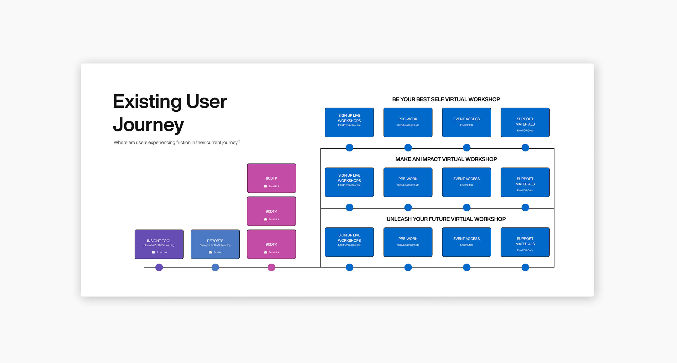
Snapshot of existing disjointed user journey and touchpoints
The Skills Discovery Toolkit emerged as a strong proof of concept for the broader learning product suite. It was a natural extension of existing business initiatives.
While the business goal was clear, it wasn’t immediately obvious how users would engage with it, or what content would feel useful in practice.
Designing for Now and Next
To meet deadlines and manage resource limitations, we had to design the Skills Discovery platform within our existing architecture. This meant working across:
- Disconnected CMS platforms
- Siloed databases
- No shared user identity system
While these constraints allowed faster delivery and reduced technical risk, they created challenges for consistency and integration. As a designer, this highlighted a key challenge I'd need to tackle:
I was going to have to build personalisation and adaptability into the experience itself rather than using system-driven logic.
It also led to a modular, component-based approach designed to minimise future rework and create patterns that could scale into Cappfinity’s future integrated architecture.
Research insights
Through internal client team interviews, an audit of a sunsetted development product, and existing user feedback, I identified key themes that guided early design decisions:


Auditing a legacy learning product
How did I use the findings from the discovery phase in the rest of the design process?
Translating insights into design direction
Identifying opportunities
I mapped research findings onto risks and opportunities, highlighting where the toolkit could deliver the most value and what pitfalls to avoid.
From emerging patterns to behavioural modes
By clustering emerging user sentiments into behavioural modes, I created a way to align design decisions with real usage patterns without the capacity to build full personas.
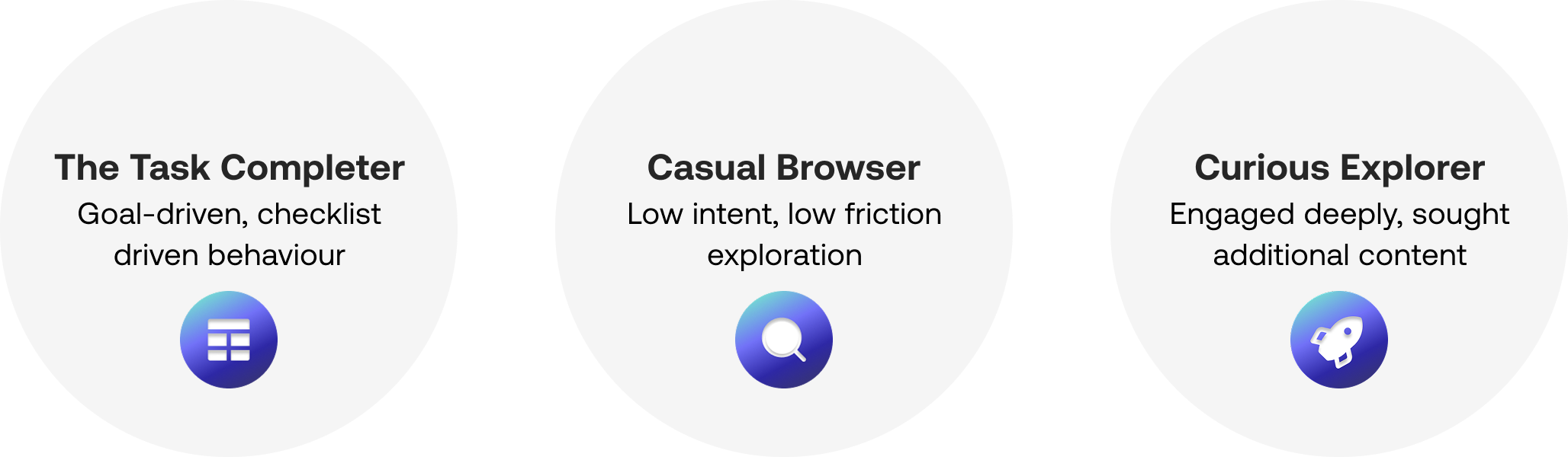
Insights from stakeholders and qualitative data were brought together to define distinct modes of user engagement with the toolkit
These modes connected to Goal Orientation Theory, giving psychological grounding to the behaviours we observed.
Together, this process showed us what the toolkit needed to achieve and how it should support different modes of engagement in an MVP.

Example of how I moved from research to the start of solution thinking through the lens of different modes of user enagement
I collaborated on design principles for the toolkit, mapping each to success metrics that tied design choices to user outcomes (engagement, repeat sessions) and business outcomes (adoption, renewals).
To bridge between long-term vision and short-term delivery, we used value–effort mapping. This helped us identify opportunities that were high-value but achievable within existing technical constraints.

Using the tension between user value and technical feasibility to narrow focus, leaving us with a set of pilot features, defining our MVP
We now had a clear MVP scope backed by evidence.
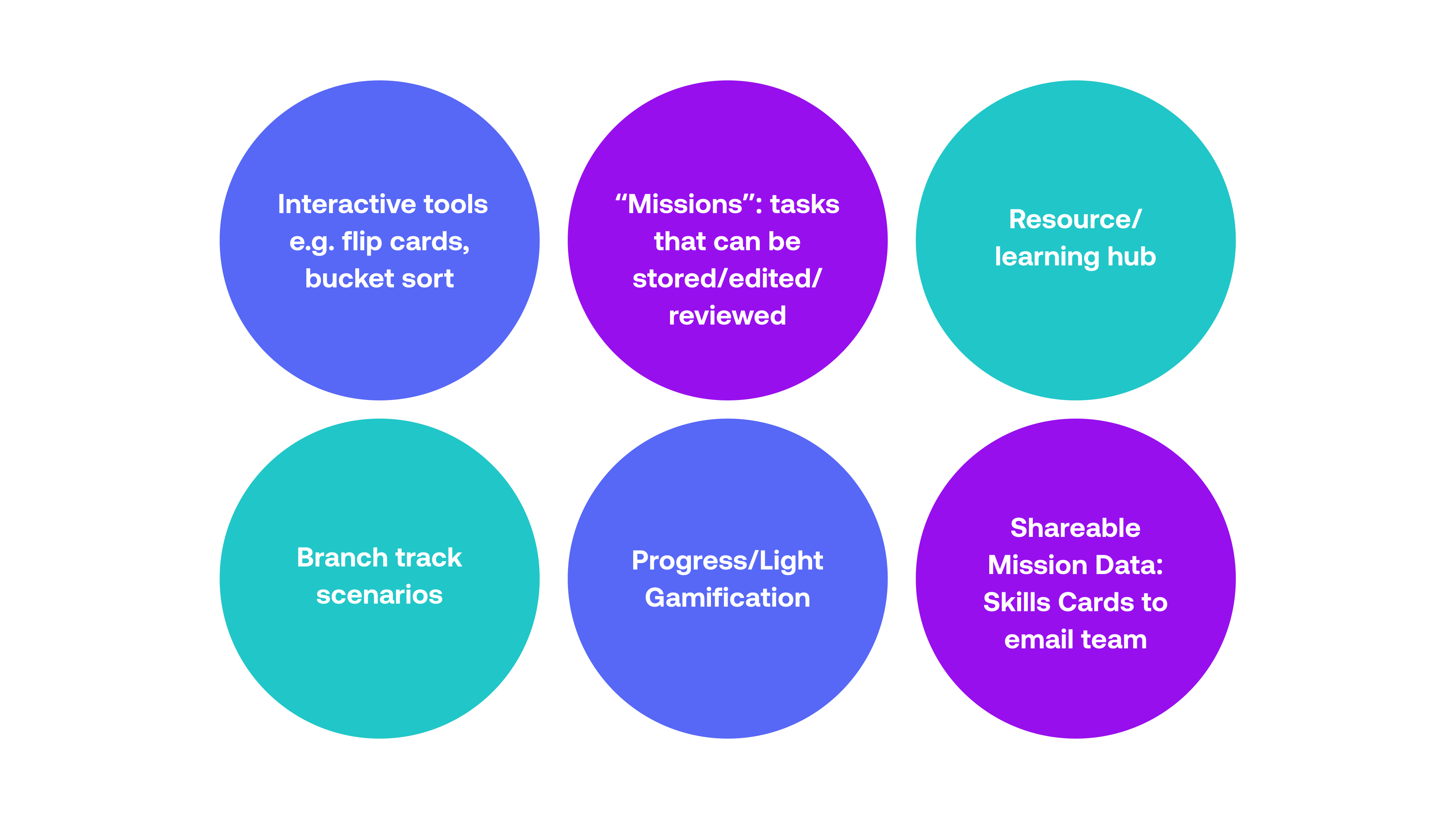
Features prioritised for the MVP chosen for technical feasibility, to maximise immediate value and easily scale for the future
Building a modular, scalable toolkit
Here are examples of how all this work translated into early wireframes and design discussions:

The elements I referred back to guide early wireframing decisions and conversations
- Navigation
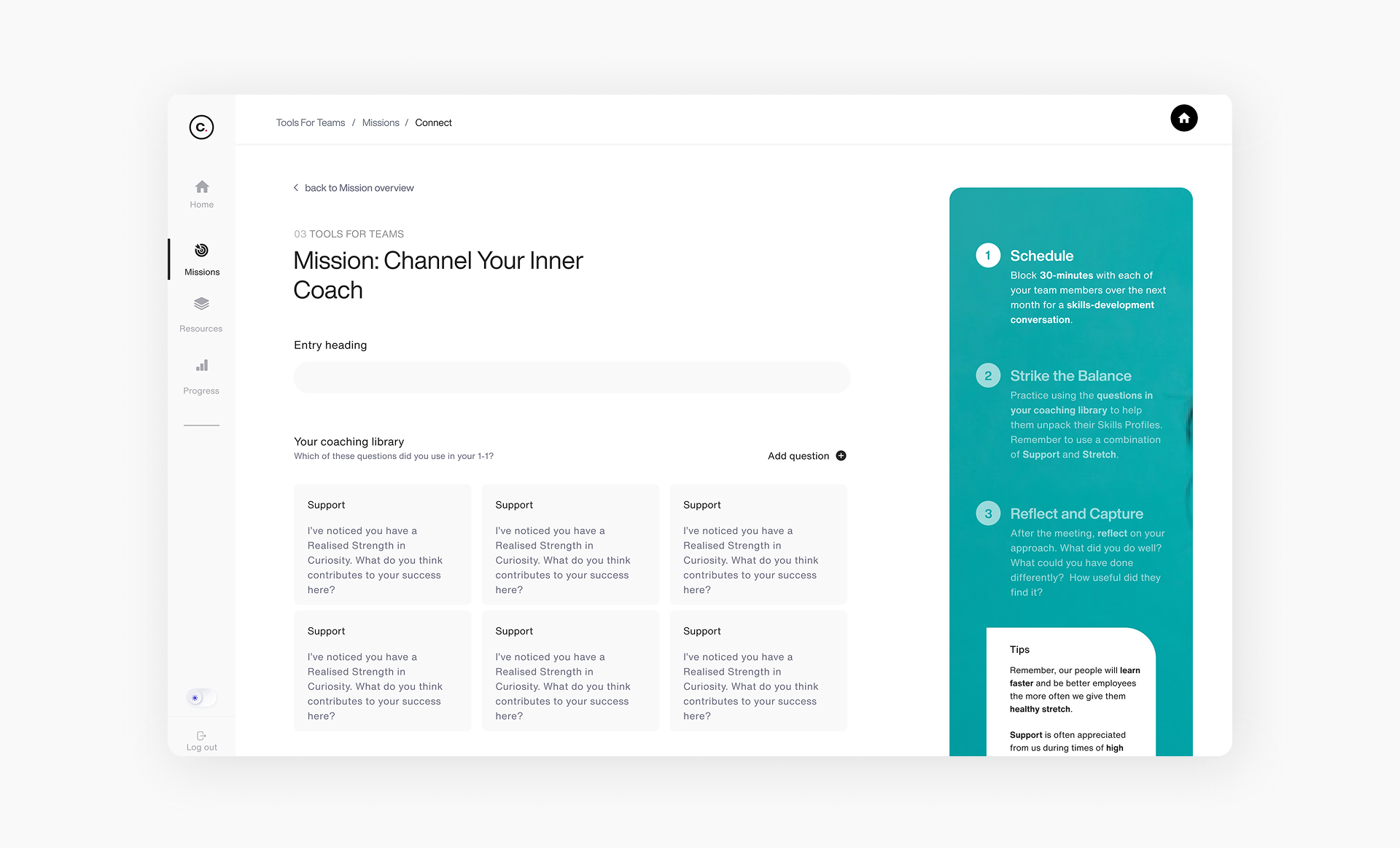
Started with best practices to reduce decision fatigue, then shifted to a more flexible model to support varying user motivations based on our established behavioural modes. - Missions
Designed multiple entry points to support both task-driven users and casual browsers at different stages of engagement. - Skills Snapshot Cards
Initially envisioned as an auto-generated, shareable prompt generator, the tool was scoped to a manual version to deliver faster within technical constraints.

An example of how I used the wireframing decision framework to make design decisions at the lo-mid fidelity wireframing stage for the Missions feature
I repeated this process across screens, seeking out feedback from engineers on feasibility and priorities from the PMs to refine these wireframes until they were in a good enough place to start applying styling.
Validating designs with usability testing
Prototype testing: early directional validation
Goal:
Validating foundational design logic, content and usability before build for efficiency.


Fully functional and interactive prototypes of the branch track scenario videos and the bucket sort component built in Figma
Beta testing with live toolkit
Goal:
Validating improvements from previous phase and evaluate stability of components in live environment

Gathering feedback from live beta testing

Design Showcase
What we delivered
A live MVP with 6 modular, reusable interactive tools
Documentation and recommendations for future integrations
A user experience designed to be revisited and part of the end users career development workflow
A style guide extracted from the learning branch of our design system, establishing a consistent foundation for future iterations
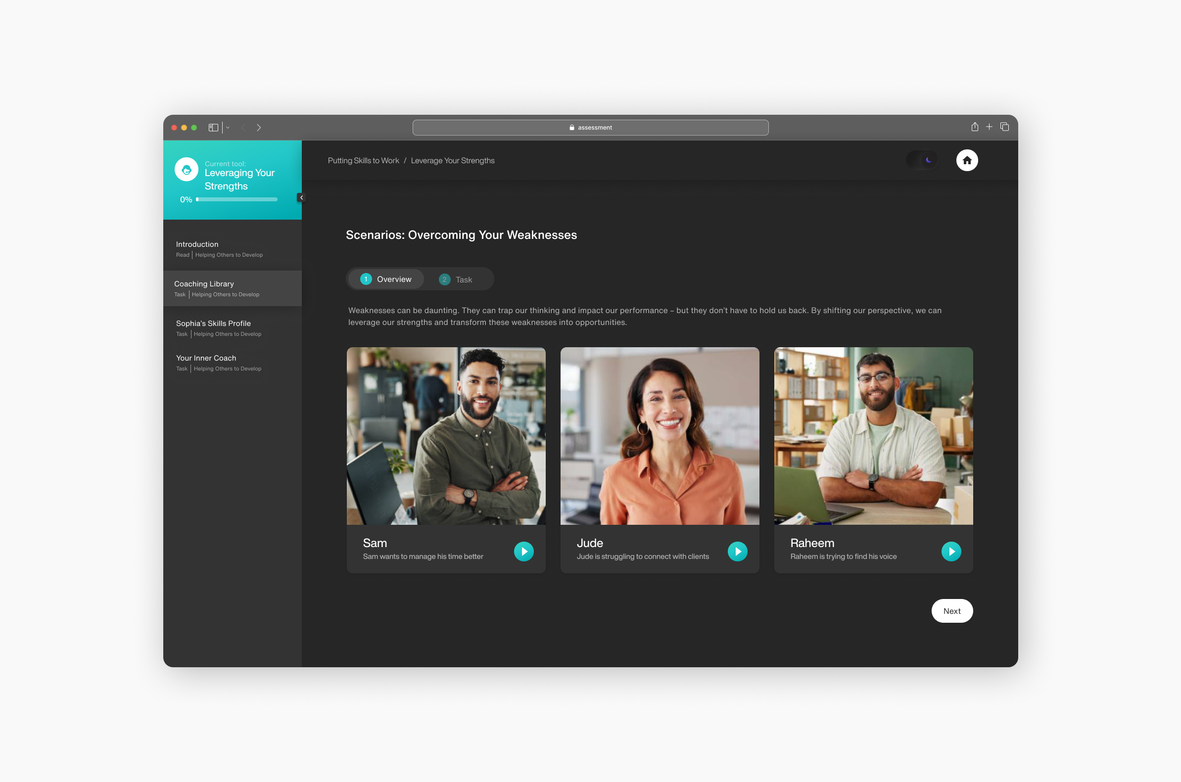
Interactive learning tools
To move beyond passive learning experiences like static PDFs, I designed reusable interactive components that encourage active engagement. These tools were designed to support better knowledge retention in a self-directed learning environment.

Responsive, Accessible Design
I designed the toolkit to be fully responsive across devices, ensuring accessibility and ease of use whether users were engaging on desktop, tablet, or mobile. Greater flexibility with how users can interact with toolkit facilitates repeat use by reducing friction.


Persistent, Revisitable Missions
Rather than one-and-done tasks, Missions allow users to reflect, save, and evolve their inputs over time. This directly solved the problem of users feeling unsure about how to use and reflect on their learnings from previous offerings.

Flexible Theming
We introduced both light and dark mode options to adapt to user needs and environments. This addressed accessibility and usability concerns. Offering flexible theming also contributed to creating a premium-feeling product experience.

Results
72% of invited employees signed up to the platform across pilot clients
Users returning for an average of 5 sessions over a four month period
A streamlined, more efficient training process for internal teams.
Ongoing validation plan
To support continuous UX improvement, I established a structured validation strategy linked to the design principles outlined earlier and the related success metrics.
Reusable foundations for faster delivery
The approach we took to building the Skills Discovery Toolkit has already started to pay off. We've been able to begin production on the next version of the toolkit significantly faster.

By investing early in reusability and scalability, the toolkit is making product development more efficient and commercially viable.
Reflections
Key Learnings
- Early alignment on both user needs and business goals is critical to designing scalable products.
- Building modular, reusable systems up front unlocks massive efficiency later.
- True cross-functional collaboration strengthens product quality and delivery speed.
What I'd Do Differently
- Taking a component-first approach alongside wireframing would have allowed us to focus conversations on the logic and reuse value of individual components - the building blocks of the toolkit ecosystem
- Push harder for lightweight external user validation earlier, even with limited resources. As we got closer to launch, we still had open questions around product positioning and commercial strategy


