As a Freelance Product Designer and Frontend Developer, I partnered with FORTH to redesign their website as it transitioned from a performance sock brand into a fitness class platform. The new site now supports class bookings, events, and product sales.

Overview
Freelance UX and Web Designer
User Journey Mapping, User Research, UI Design, Content Strategy, Front-End Implementation (HTML/CSS/JS)
Team
Freelance Product Designer and Frontend Developer
Date
December 2024 - February 2025
32% increase for CTR on booking links
15% decrease in bounce rate
Stronger design unity across touchpoints
The website no longer reflected the business focus
FORTH started with performance socks, but fitness classes quickly proved more popular. The founder pivoted, but the website didn’t. Despite classes driving 95% of revenue, it still wasn’t built to support booking journeys.
These early conversations with the client gave me a clear scope for what I needed to deliver the client. But it also made space to think about what the brand would need next.

Identifying what the client needed from me, helping me create my project plan
Key business goals
*No baseline metrics established at this stage
Understanding the project constraints
The journey to the problem statement
User Feedback and Behavioural Analytics
To identify real user behaviours, I made use of Shopify's built-in analytics and existing support DMs and emails:
Low engagement with deeper-level pages (often containing critical information like packages and pricing)
Over 90% of traffic came from social media or direct search, suggesting high-intent users
Bounce rate was high on homepage and "The FORTH Club" page, suggesting drop-off due to confusion or dead ends
Hey, saw pilates on Instagram but couldn’t find it on the site.

...I'm trying to book a class but can't find it?
What are the add-on options for private bookings?
User flow mapping
I chose not to create a full journey map at this stage due to limited access to validated user insights and emotional context.
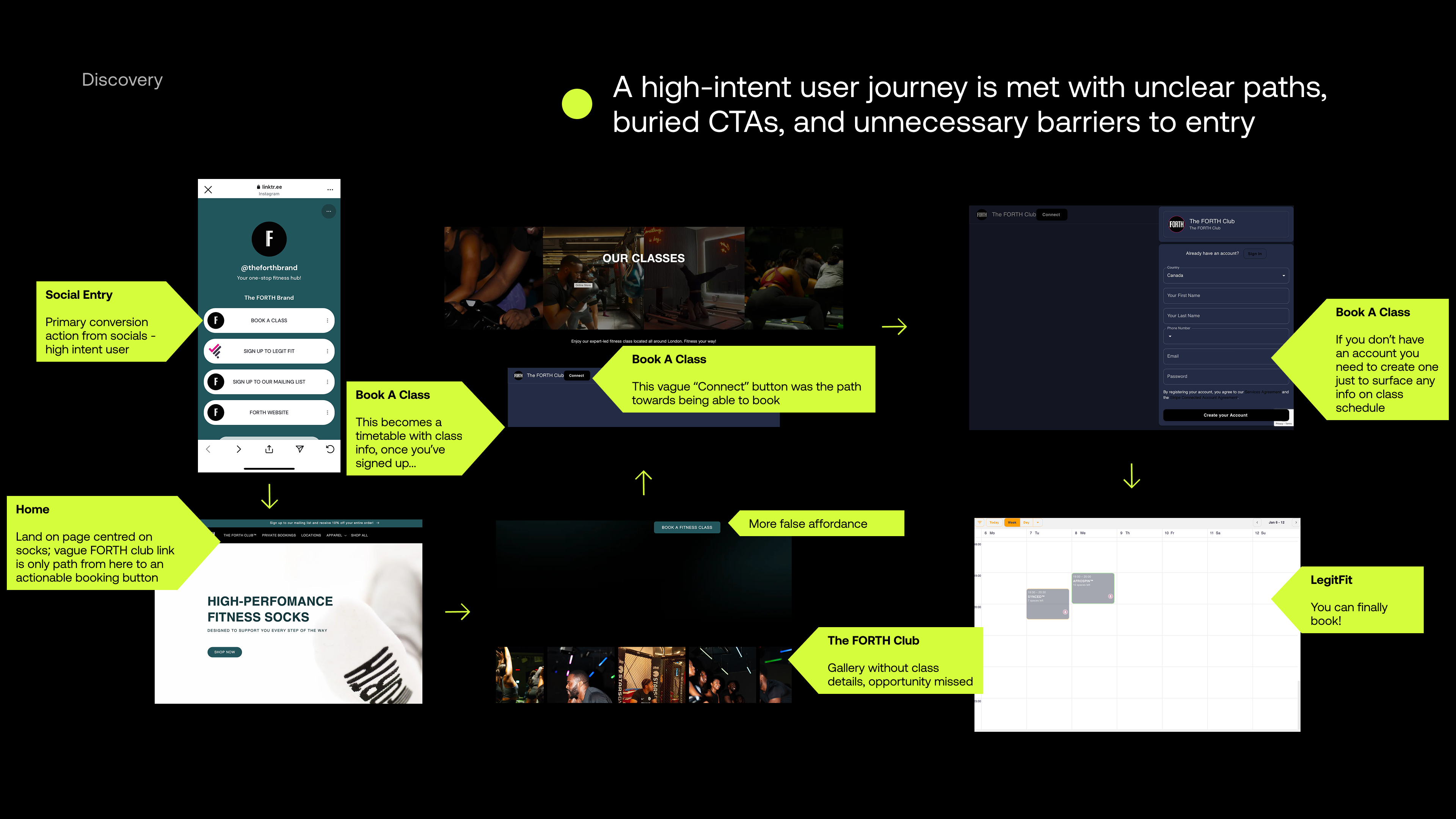
Mapping out all the friction points in the user flow for the process of booking a class starting on social media
UX/UI heuristics review
From there, I moved into a heuristics review, zooming into key screens to evaluate usability issues and any patterns of inconsistency or confusion.

Existing visual inconsistencies between different areas of the website
Key actions related to booking buried 4 layers deep
Visual inconsistencies across pages
8 false affordances caused by unclear or misleading copy choices
Content and Information Architecture Analysis

The most valuable real estate on the website was still focused on fitness socks

The original sitemap prioritised products over classes, with key actions buried and broken pages disrupting the user journey
Homepage messaging still prioritised fitness socks
Use of branded labels led to confusion about site content
Low context and broken pages were blockers to action for the user
High-intent users came ready to book a class but faced friction: the site still prioritised socks, buried key actions in complex navigation, and lacked the community visuals users saw on social channels. This disconnect between brand and experience disrupted the journey and reduced credibility.
Structuring the new experience
What users need to be able to do
To begin translating findings into structure, I started restructuring core user flows. Each of these flows begins with a high-intent user action.

Defining user flows for core actions and the steps needed to support them
Mapping the restructured user flows helped me identify what users needed at each step to achieve the intended outcome of each key user action.
What are these experiences made of
Updated user flows helped me identify the content objects needed at each step. Using the ORCA process from OOUX, I mapped key objects like Class, Instructor, and Package—their relationships, attributes, and associated CTAs to begin shaping the interface.

Defining user flows for core actions and the steps needed to support them
Where do these actions and objects live
This process got me to a revised sitemap. Knowing what users needed to complete a core action meant that I could structure the website to surface the right information at the right moment.

A simplified, intent-led structure shaped by user flows and content objects
Simplified to prioritise driving high-intent users toward conversion
Surfacing key actions like booking, viewing the timetable, and exploring packages
Each nav item was built around a single user action or question
Clearer access points to the third-party booking platform
Putting concepts to screens
With flows and content relationships defined, I prioritised wireframing components instead of full pages. This best supported how the client would build and update the website, using Shopify's theme editor.
I'll now walk you through an example of how I used the ORCA process to make design decisions:
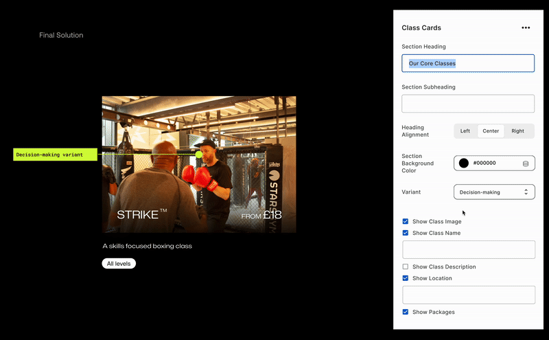
1) Shared Object: "Class"
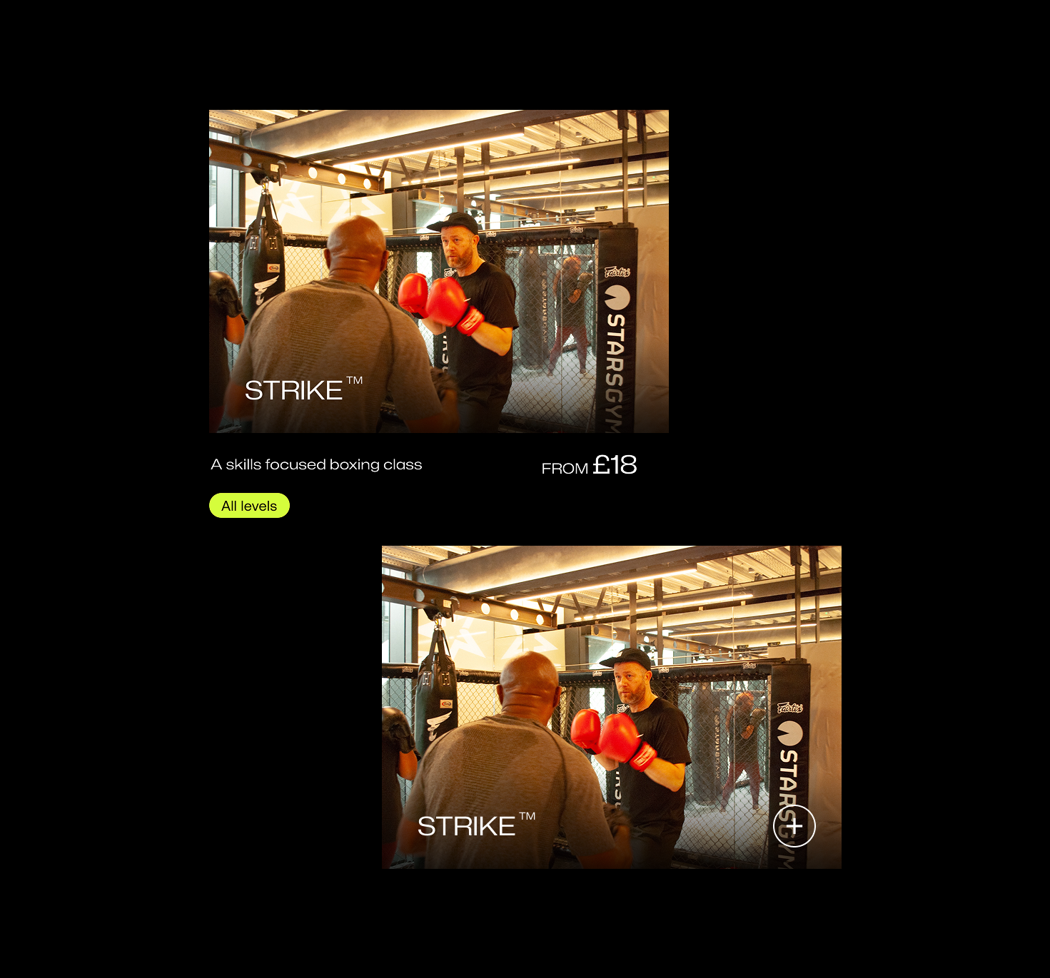
“Class” emerged as a core object across touchpoints. I defined its schema and mapped key attributes, then designed a neutral class card—a flexible pattern that holds all attributes without locking in display rules.

Reusable foundation — contains all relevant attributes
2) Mapping entry points to mindsets
I looked back at the user flows and insights to start answering the question: “How do these attributes show up for the class card?”. By mapping out key touchpoints and the possible associated goals, it became clear that the way users would use the "class" object might vary by context.

Showing the different intentions a user might have interacting with class information on the homepage vs the timetable page
3) Emerging contextual variants
I explored how users might interact with the “Class” object on the homepage vs. the timetable. Based on hypothesised goals and mindsets, I designed two class card variants—one for the more exploratory mindset likely found on the homepage.

Lofi wireframes of the homepage variant of the class card component
On the timetable page, users are in a more intentional, decision-focused mode, so the class card variant surfaces more attributes to support logistical decisions.

Lofi wireframes of the timetable variant of the class card component
Further considerations
Platform limits shaped the design. For example, class cards couldn’t link to specific packages or filtered timetables. To manage expectations, I kept a generic “Book a Class” CTA separate from the cards, avoiding confusion over where links would lead.
Guidelines for visual design
While a full design system wasn’t required, it was important to establish a process for design that could be maintained by a small internal team.


The visual foundations to support FORTH's brand presence across all user touchpoints
In addition to visual foundations like colour and typography, the style guide also included practical guidelines for key UI components.


Usage guidelines to support the proper implementation
Coding in a modular way to support a non-technical team
Because I’d approached design with modularity in mind from the start, I was able to build reusable components using Shopify's JSON schema. This meant that the same components could adapt across the site and its content could be updated without touching code.
Building things as modular components gave the client "CMS-like" functionality by being able to add components on to the screen, swap images and content on the screen without interacting with code using Shopify's theme editor
Design Showcase
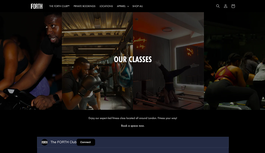
Reframing the homepage
The homepage was redesigned to prioritise key actions like booking a class or checking the timetable. This meant that there were now two direct booking links above the fold.

The "What is FORTH?" question
Users arriving from social channels felt confused about what FORTH actually offered. The About carousel was designed to quickly communicate their brand story as well as their offerings, whilst creating a clear path to conversion.

Flexible, reusable components
Reusable components designed to adapt across contexts, streamline core user flows, and strengthen brand consistency.
Designed for discovery: Flexible class cards that adapt to user goals
Designed for transparency: a timetable that's visible without sign-ups or redirects

Designing for connection: a scrollable instructor slider to humanise the experience

Mobile-first considerations
With most users arriving from Instagram, I ensured that important content and actions were easy to scan, tap, and navigate on small screens.

Designing for third-party handoffs
To ease the shift to a third-party booking platform, I added a redirect screen that helped set expectations and maintain trust.

Visual consistency across touchpoints
Visual continuity in image style whilst reinforcing class brand identities through colour and image effects

Outcomes
32% increase for CTR on booking links
15% decrease in bounce rate
Stronger design unity across touchpoints


Future-focused
Broader Journey Recommendations
- Link directly to LegitFit from Story CTAs
- Use class-specific colours and patterns in social posts
- Leverage LegitFit’s automated emails and push notifications for re-engagement
- Follow up with class-specific content
- Use email comms for feedback to start building a repository of user insights
If I were to continue working with FORTH...
- Track clicks on all booking CTAs, by page, to understand which content drives the most conversions.
- Run A/B tests on button language, CTA placement, or layout order etc.
- Collect feedback after booking via a quick email survey or embedded form to understand lingering friction points.


