As the Product and Experience designer, I led the design of the Skills Discovery toolkit to help organisations engage in meaningful employee development. This B2B tool was built to turn key concepts in positive psychology into a simple, intuitive experience, designed for long-term engagement and client value.

Overview
Skills Discovery Toolkit is part of a new product offering launched by Cappfinity, focused on helping individuals and organisations unlock and apply their strengths. Building on Cappfinity’s reputation as a world leader in Talent Acquisition & Talent Management, the toolkit expands their offerings in the Talent Development space, with this product serving as the foundation.
Product and UX Designer
UX Audit, User Research, Usability Testing, Prototyping, UI Design, Interaction Design
Team
2 Engineers, Product Owner, 2 Content Strategists
Date
April 2024 - February 2025
Early feedback showed users felt more confident navigating, revisiting and using the content, signalling improvements in long-term product value
Reduced delivery complexity and content duplication, moving from fragmented tools to a single experience

Laid the foundation for a new product suite with strong upsell potential, supporting the company’s expansion into the talent development space
Expanding the vision for a trusted product
At Cappfinity, we believe in a world where skills and potential create opportunity for all.

Cappfinity are global leaders in measuring and developing potential in Talent Acquisition and Talent Management. They deliver immersive solutions that help organisations hire effectively and map skill requirements to organisational needs.
Where were Cappfinity headed?
Part of the process of Talent Management was Talent development - the ongoing learning and growth of existing employees. Cappfinity’s development offerings had grown over time on an ad-hoc basis, resulting in fragmentation: inconsistent branding and content delivered through disconnected platforms (PDFs, emails, various online portals).
Internally, this fragmentation naturally created inefficiencies in delivery and design. This reduced profitability, made upsell opportunities harder to execute, and reduced the perceived value of what we were trying to do in the talent development space.

Existing fragmented and redundant user flows
At first, the approach to the problem was much narrower: clear up existing documents and touchpoints with standardised branding. But over time it became clear there was a real opportunity to create a new product initiative that would enable scale as Cappfinity established itself more across the entire talent lifecycle.
As Cappfinity expanded its talent development offering, internal tools and content had become fragmented, inconsistent, and difficult to maintain. We needed a scalable, unified solution that could improve delivery efficiency, strengthen brand perception across the talent lifecycle, and support long-term growth in this space.
The Skills Discovery Toolkit emerged as a strong proof of concept for the broader product suite. We had recently launched a B2B-focused version of the Skills Discovery Assessment, designed to help users map their Realised Strengths, Unrealised Strengths, Learned Skills, and Weaknesses and it was generating a lot of client interest. The toolkit offered a natural extension of this, acting as a self-directed alternative to a 1:1 debrief with an assessment coach. It could create a compelling opportunity for upsell.
While the business goal was clear, it wasn’t immediately obvious how users would engage with it, or what content would feel useful in practice.
Reframing the business goal through the lens of the user
Navigating research constraints
Limited direct access to end users

Compressed timeline due to other project demands
Securing buy-in for research due to limited value from previous attempts
Determined to not go into the design process blind, I had to get resourceful. I needed the research methods to be lightweight enough to not be too resource-intensive whilst still having impact. This made it easier to justify the value-to-effort ratio in the face of push back and an opportunity to change the attitude towards research in the company.
I created and secured sign-off for the following research plan:
Client-facing interviews
Capture common friction points, user feedback and delivery challenges through proxy users.
Audit of legacy
product
Identify structural and content weaknesses in the previous toolkit.
Review of existing user feedback
Identify patterns in user sentiment, feature requests, and drop-off points.

Auditing a legacy learning product
Key insights
- Internal teams needed a more structured and unified approach to content
- Some "power users" were screenshotting their entries to share with others
- Poor feedback interactions on responses and user actions
- Very content dense with minimal interactivity
- Users want to be able to revisit reflections
- They didn't see much value in one-off tasks
- Users noticed the content duplication/irrelevance caused by internal inefficiencies in delivery
How did I use the findings from the discovery phase in the rest of the design process?
Translating insights into design direction
Identifying opportunities
The research brought to light some recurring themes. The first step to figuring what exactly I should do with them involved creating a sort of "opportunity-risk" map.
This involved taking individual or compounding insights and synthesising them as opportunities (what could a solution to this insight look like) and risks (what are the potential impacts of not solving for this in our final solution). This would directly feed into future decisions I made and what I prioritised.

A snapshot of the process of mapping user insights onto risks and opportunities
From emerging patterns to behavioural modes
This process of opportunity mapping clarified what the final solution needed to do but not how different users might engage with what we built. Behavioural modes helped us bridge that gap, aligning the design with real patterns of use and further grounding our decisions.
Behavioural modes represented situational mindsets rather than fixed identities, allowing me to start to thinking about how to design an experience that adapts to different types of engagement. This kept the user at the centre of the process even when we didn't have the depth of insights necessary to form full, actionable personas.

Insights from stakeholders and qualitative data were brought together to define distinct modes of user engagement with the toolkit
These behavioural modes flowed directly from the research and helped me start to think about how to implement the opportunities the research surfaced.

How I moved from research to the start of solution thinking through the lens of different modes of user enagement
This was the first step towards more solution-oriented thinking.
Converging on an MVP
Understanding the technical constraints
Before jumping into putting solutions to screen, it was important clarify what constraints I was working within:
Disconnected CMS platforms
Assessment and toolkit sat on separate systems so we couldn't integrate personalised assessment information
No shared user
identity
We couldn’t pass data across platforms so users had to create another account separate to the assessment platform
Disconnected
databases
We couldn’t trigger automated onboarding or
re-engagement flows
With all the user insights and technical constraints in mind I reframed the initial problem into a single, focused challenge:
How might we create a modular, cohesive toolkit experience that adapts to different user behaviours and delivers long-term value despite the lack of shared user identity, automated flows, or integrated content systems
Designing with intention
To ensure alignment and clarity on what we were doing with toolkit, we collaboratively came up with 4 design principles. I then mapped each principle on to specific success metrics:
Design for Repeatable Reflection

Measuring Return & Reuse
Keep Interactions Lightweight
Measuring Clarity & Depth
Content-Led Relevance
Measuring Perceived Usefulness

Structure for Sustainability
Measuring Internal Efficiency
Value-to-effort mapping
A vital step towards converging on a design solution was mapping out our ideas based on the impact it would have on the user and how hard it would be to implement with the existing technical architecture in mind.
With no restrictions, we all thought about and brought ideas into the session that we then organised on this matrix. These discussions resulted in our product MVP as well as helping us set the foundation for a clear product roadmap.

Using the tension between user value and technical feasibility to narrow focus, leaving us with a set of pilot features, defining our MVP

Features prioritised for the MVP chosen for technical feasibility, to maximise immediate value and easily scale for the future
How does it all come together?
We started by defining a set of modular, content-agnostic tools that could flex across topics. These gave the content team a clear framework to work within.
From there, the content team grouped these tools into three thematic learning areas. This work from the content team shaped most of the sitemap for the toolkit:

The final MVP sitemap for the Skills Discovery Toolkit platform
User journey mapping
From there, I began working on mapping out a couple of prospective user journeys for both first time and returning users. This was important given that retention was going to be a huge indicator of success for this work and so I needed to design with the touchpoints that could drive repeat use at the top of mind.


A snapshot of the proposed user journeys for first time and returning visitors, focused on goals and emotions at each stage of the journey
Collaborating early and often to balance vision, user needs, and feasibility
Weekly Sessions
helped the team align on priorities and user flows, keeping momentum and reducing handoff friction
Real-Time Problem Solving
meant engineers could flag technical constraints early, allowing for faster iteration
Co Creation of Tools
between content and UX helped balance narrative clarity with interaction design
MVP Co-Definition
was a shared effort, enabling us to scope features based on both user needs and delivery feasibility
Building a modular, scalable toolkit
What guided my wireframing process
Spending so much time upfront defining what the right direction was for the toolkit made the design phase far more efficient. The process gave me this "framework" that could shape design explorations in a much more focused way - fewer dead end design decisions and unnecessary iterations.

How all of the work we'd put in helped me define a framework that guided my design explorations, making things much more efficient and focused
Adapting one feature for different ways of engaging
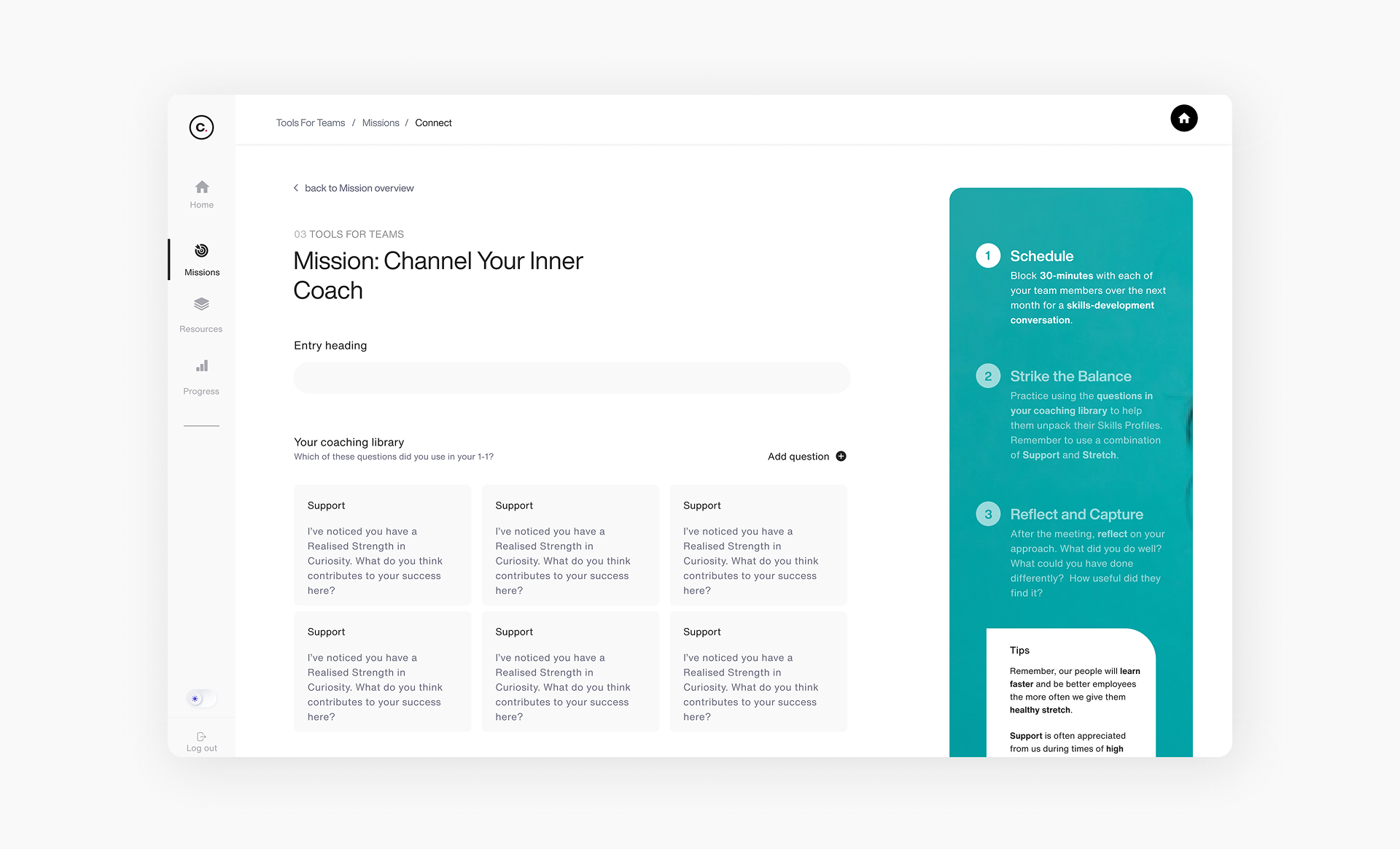
Here’s an example of how this framework came to life in the process of designing the "Missions" experience:

An example of how I used the wireframing decision framework to make design decisions at the lo-mid fidelity wireframing stage for the Missions feature
Every part of this layout was intentionally shaped by our guiding inputs: user insights, behavioural modes, design principles, technical constraints, and the features we had prioritised.
For example, I supported Task Completers with a clear progression checkpoint after tool completion and created a direct flow into the relevant Missions section as a next step to "tick off", to retain engagement through momentum.
For Casual Browsers, I ensured that details about the Mission purpose and what it would entail were shown in concise, digestible layouts, allowing users to understand what's available in the toolkit without having engage more deeply with the content.
For Curious Explorers, I designed the mission entries to be revisited and edited, allowing users to build on their thinking over time.
I repeated this process across screens, seeking out feedback from engineers on feasibility and priorities from the PMs to refine these wireframes until they were in a good enough place to start applying styling.
Validating designs with usability testing
After refining the high-fidelity designs and creating a fully interactive toolkit in Figma, I was ready to gather user some initial feedback on the experience.
Again due to constraints, this testing was done with client-facing internal team members as opposed to real end users.
Prototype testing: early directional validation
Goal:
Validating foundational design logic, content and usability before build for efficiency.
- Users struggled to form a clear mental model of the toolkit
- Refine homepage copy to emphasise value of key features and tutorial; consistent page structure and modular layout
- Navigation was generally intuitive, but lacked reinforcement
- Include breadcrumbs, progress indicators for each section; persistent exit points; active state cues; reposition page heading and details
- Missions were perceived as one of the highest value areas of the toolkit
- Make Missions more prominent so users can access them quickly and understand their value upfront; more guidance to help users get the most out of them
- Uncertainty around positioning limited perceived value for non-managers
- Update approach to content for certain areas of the toolkit to broaden relevance


Fully functional and interactive prototypes of the branch track scenario videos and the bucket sort component built in Figma
Beta testing with live toolkit
Goal:
Validating improvements from previous phase and evaluate stability of components in live environment
- Broken buttons, browser compatibility issues, unreliable interactions
- Full interaction QA audit; rebuilt or simplified interactive components
- Task instructions and video-based activities still felt unclear
- Usage prompts before video content; repositioning task support information on screens
Beyond implementing these changes, I also reskinned the toolkit in line with a brand change that was taking place at the time for the Skills Discovery product.
What was great about the phase was the fact that after just one round of design QA, we were ready for rollout. I attribute this to the fact that we'd all been so involved in the process of building this toolkit from the start that design execution was being treated as a shared responsibility.
Design Showcase
What we delivered
After 10 months of collaboration, content and UX design and development reworks, we successfully delivered:
A live MVP with 6 modular, interactive tools
Documentation and recommendations for future integrations
A user experience designed to be revisited and part of the end users career development workflow
A style guide extracted from the learning branch of our design system, establishing a consistent foundation for future iterations
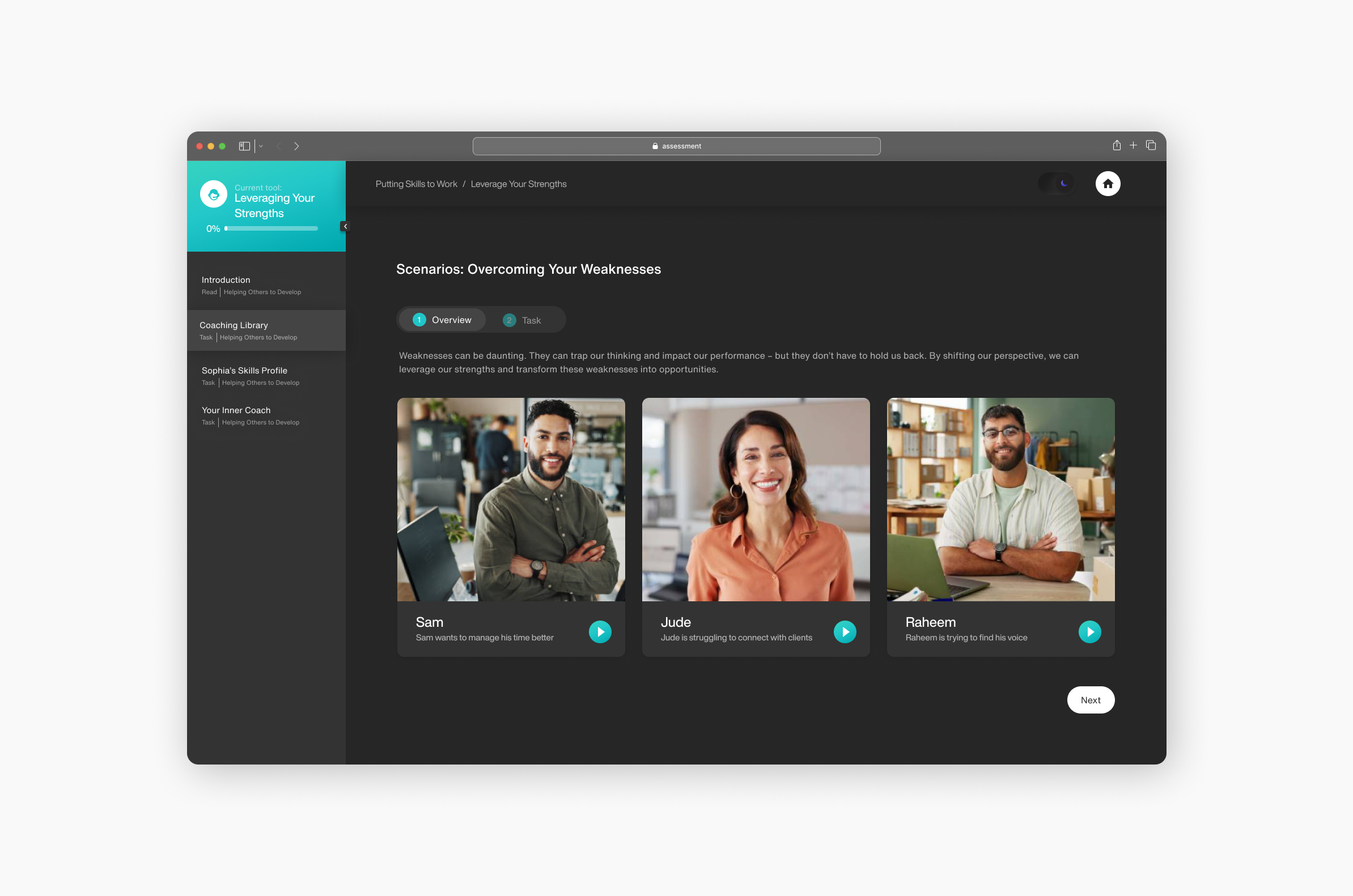
Interactive learning tools
To move beyond passive learning experiences like static PDFs, I designed reusable interactive components that encourage active engagement. These tools were designed to support better knowledge retention in a self-directed learning environment.

Responsive, Accessible Design
I designed the toolkit to be fully responsive across devices, ensuring accessibility and ease of use whether users were engaging on desktop, tablet, or mobile. Greater flexibility with how users can interact with toolkit facilitates repeat use by reducing friction.


Persistent, Revisitable Missions
Rather than one-and-done tasks, Missions allow users to reflect, save, and evolve their inputs over time. This directly solved the problem of users feeling unsure about how to use and reflect on their learnings from previous offerings.

Flexible Theming
We introduced both light and dark mode options to adapt to user needs and environments. This addressed accessibility and usability concerns. Offering flexible theming also contributed to creating a premium-feeling product experience.

Results
Early Validation
While the toolkit has only recently launched, we've conducted early validation with internal client-facing teams and a pilot client cohort.
Key early signals
- Positive feedback on the clarity of the navigation and modular structure
- Strong perceived value in the ability to revisit and build on reflections
- Pilot users described the toolkit as a noticeable improvement in ease of use compared to previous offerings
UX Outcomes
- Supported both light and deep engagement through flexible interaction models
- Early feedback showed users felt more confident navigating and returning to content
Organisational Impact
- Showcased efficiency of highly collaborative process
- Built modularly, reducing overhead for content and tech teams
- Created shared language and process for future toolkit design
Strategic Value
- Toolkit now forms the model for future development solutions
- Created internal momentum into development-focused offerings
Post-Launch Validation Plan
To support continuous UX improvement, I established a structured validation strategy linked to the design principles outlined earlier and the related success metrics:
Design for Repeatable Reflection

Research Focus
Keep Interactions Lightweight
Research Focus
Content-Led Relevance
Research Focus
Structure for Sustainability
Research Focus
Reusable foundations for faster delivery
The approach we took to building the Skills Discovery Toolkit has already started to pay off. We've been able to begin production on the next version of the toolkit significantly faster.

By investing early in reusability and scalability, the toolkit is making product development more efficient and commercially viable.
Reflections
Key Learnings
- Early alignment on both user needs and business goals is critical to designing scalable products.
- Building modular, reusable systems up front unlocks massive efficiency later.
- True cross-functional collaboration strengthens product quality and delivery speed.
What I'd Do Differently
- Taking a component-first approach alongside wireframing would have allowed us to focus conversations on the logic and reuse value of individual components - the building blocks of the toolkit ecosystem
- Push harder for lightweight external user validation earlier, even with limited resources. As we got closer to launch, we still had open questions around product positioning and commercial strategy


