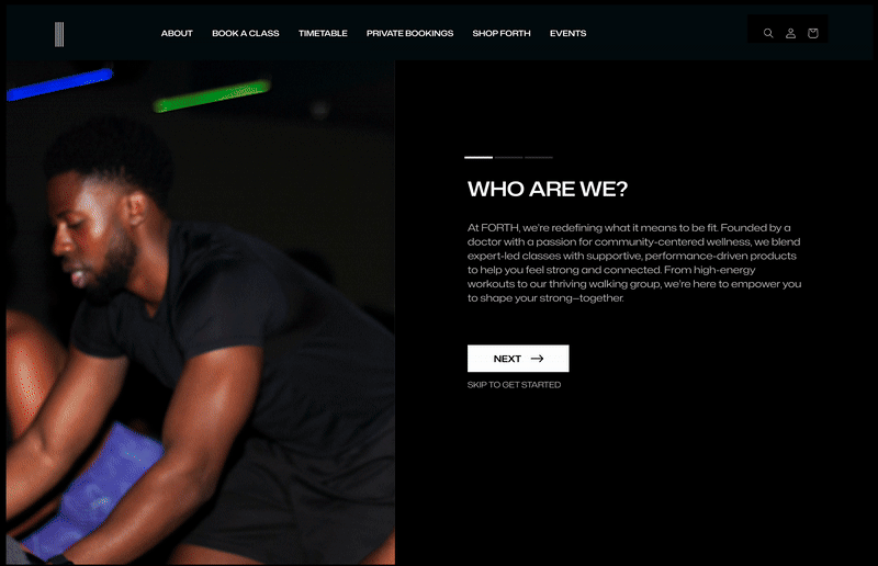
Redesigning a website for a brand that outgrew its platform

This redesign repositioned the website to focus on the revenue-generating area of the business and streamlined the user journey.
Freelance UX Designer
Frontend Development
5 months
Mobile, Web

Listening to what the community actually showed up for

FORTH launched with a focus on performance socks but soon realised that it was the fitness classes that they were using to market their socks that consistently engaged their audience.  The company made the pivot towards fitness classes as their primary offering with it now generating roughly 90% of their revenue.

The website did not reflect the new business direction

Most visitors arrived on FORTH’s site with clear intent, driven by direct CTAs from social media. However, the website no longer reflected FORTH’s evolving offer or brand direction, leading to confusion. Poor product positioning, inconsistent navigation, and low-context pages created unnecessary friction, while broken links and dead ends blocked the path to purchase. High-intent traffic was being lost.

From insight to interface: designing for clarity, consistency and constraints

To create a more intuitive, content-led navigation model, I applied the ORCA process to identify and define key content objects, such as “Class,” which became the foundation of the site’s structure. This allowed me to design modular components that surfaced relevant content to guide users toward action. With a small internal team and no in-house developers, I prioritised reusable patterns that worked seamlessly with Shopify’s theme editor. The result was a flexible site architecture that was quicker to implement, easier to maintain, and better aligned with how users explore FORTH’s offering.

Designed for scale and clarity

Every design decision was shaped by what users needed and what the business could realistically support. From restructured booking flows to scalable component systems, the final UI brings clarity to the offering  while staying flexible within the Shopify framework.

Clarifying who FORTH are

To address early confusion around what FORTH offered and who it was for, I introduced a prominent “About” slide that clearly articulated the brand’s story, mission, and offerings. Paired with visuals and direct links to booking, this clarified FORTH’s purpose whilst creating a clear pathway to conversion.

Flexible, scalable component variants

Designed around modular components using JSON schema, the site’s sections were built to be easily updated or extended by the internal team. For example, I built flexible class card variants tailored to different stages of the user journey: discovery vs decision-making mode.

Mobile-first considerations

With most users arriving from Instagram, I ensured that important content and actions were easy to scan, tap, and navigate on small screens.

Designing for third-party handoffs

To improve trust and reduce drop-off during booking, I designed context-setting elements around the LegitFit redirect.

Simplifying booking management

New private booking forms replaced scattered DMs and emails with a streamlined, centralised system, making it easier to manage enquiries and set expectations. This aligned with the business’s growing demand for private sessions.

Visual continuity across touchpoints

To build brand recognition and trust, it was essential to create visual consistency across the user journey. This included social content and emails as well as the website. I extended FORTH’s  aesthetic across all key touchpoints, ensuring typography, colour, and visual tone worked together to form a cohesive experience.

Laying the foundation for growth and scale

15% decrease in bounce rate

32% increase for CTR on booking links

Higher return visitors to the website

VIEW FULL CASE STUDY

More to explore

Image previewing the Skills Discovery Toolkit product I designed

Skills Discovery Toolkit Showcase

PROJECT SHOWCASE

Cappfinity Design System Showcase

PROJECT SHOWCASE